

Started of with simple Ideas.


"Looks too much like the fantastic 4 logo"

The compass design had been done many times before.


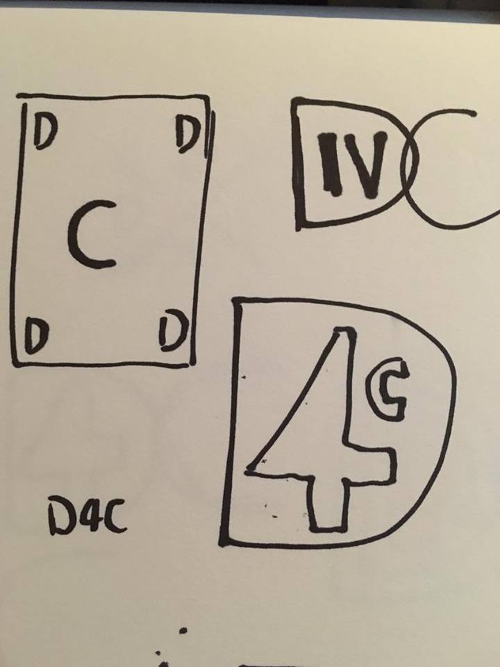
I was trying to find different ways I could include the 4 D's, maybe a playing card ?


I eventually tried this skull in profile, but couldn't think of a way to make it relevant,
so I tried drawing it from the front.

The idea we liked was that we made the 4 D's the teeth of the skull.


Here was the final rough version of the Logo. Now we go digital.


The four final thumbnails.


Final Designs.


http://d4cstudios.blogspot.co.uk/


good stuff, though I do like the blue/red version too - it's quite iconic.
ReplyDelete